

Position: Product Designer | Team: CEO, Full Stack Developer, Product Designer
***Note: This project is still ongoing, however below is a snapshot of some completed and in-progress work.
Ziprent is a product aimed at leveraging technology to automate the process of finding the best possible tenant for a given property. Finding a tenant is often an exhausting process. Landlords have to not only create multiple listings, but run multiple credit checks, background checks, employment verification, for every applicant they recieve. The goal of Ziprent is automate the majority of these processes, and present landlords with a ranking of suitable candidates based on a multitude of factors.
One of the first projects was to create and develop the product website. We set out to focus on the following:
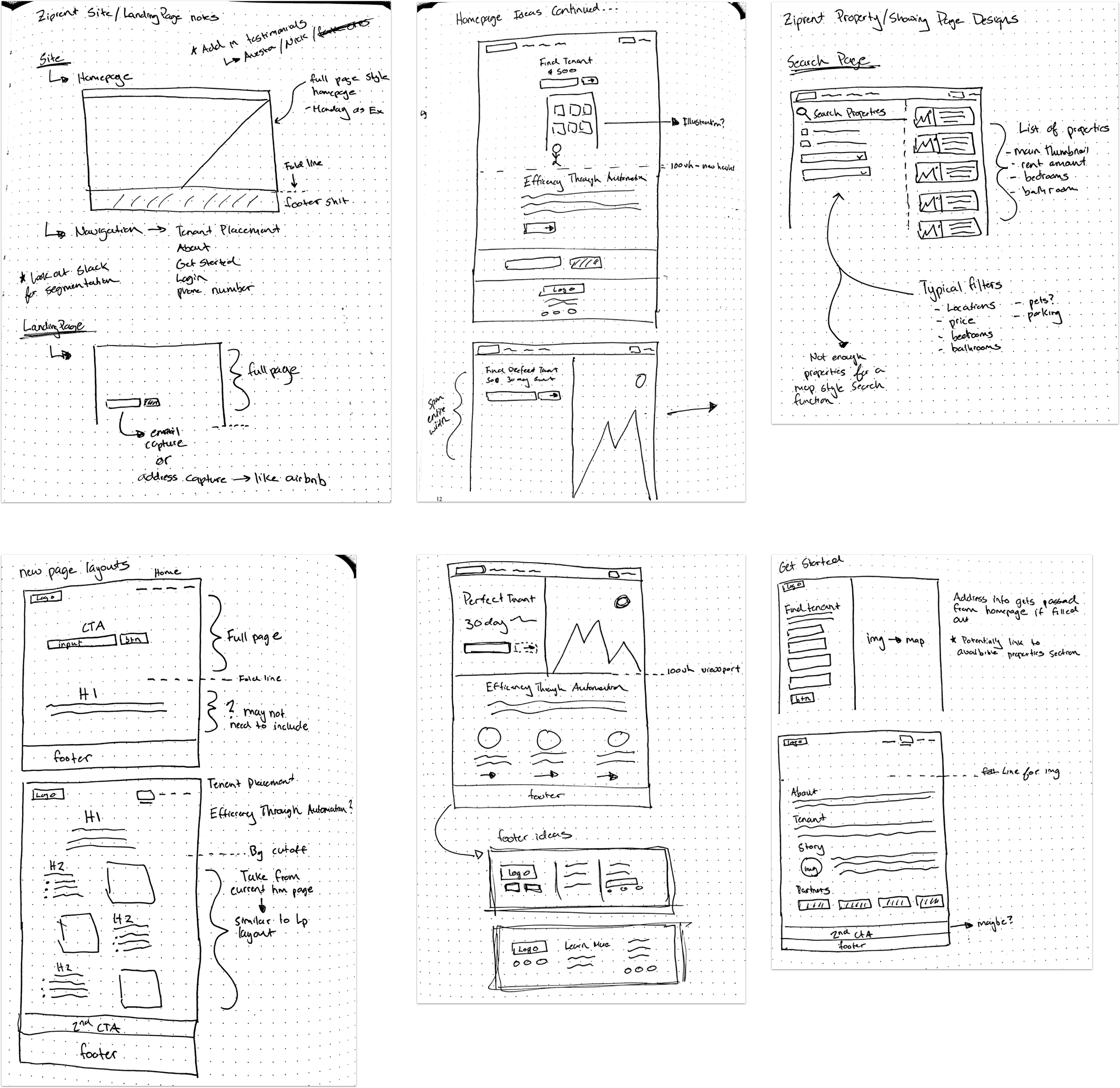
I first began with some simple concept sketches to play around with layouts and site architecture options.
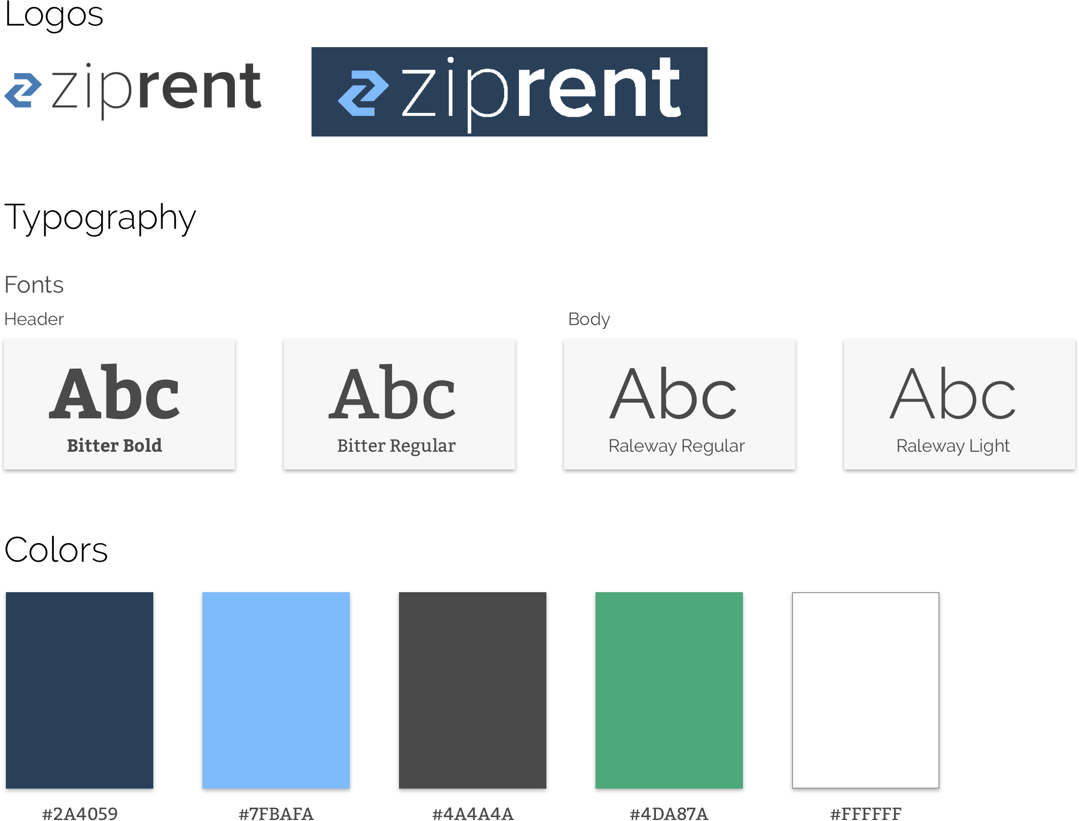
From there I went into creating a simple style guide to provide as a foundation. I was able to reference the current backend application to create consistency with color choices and typography.
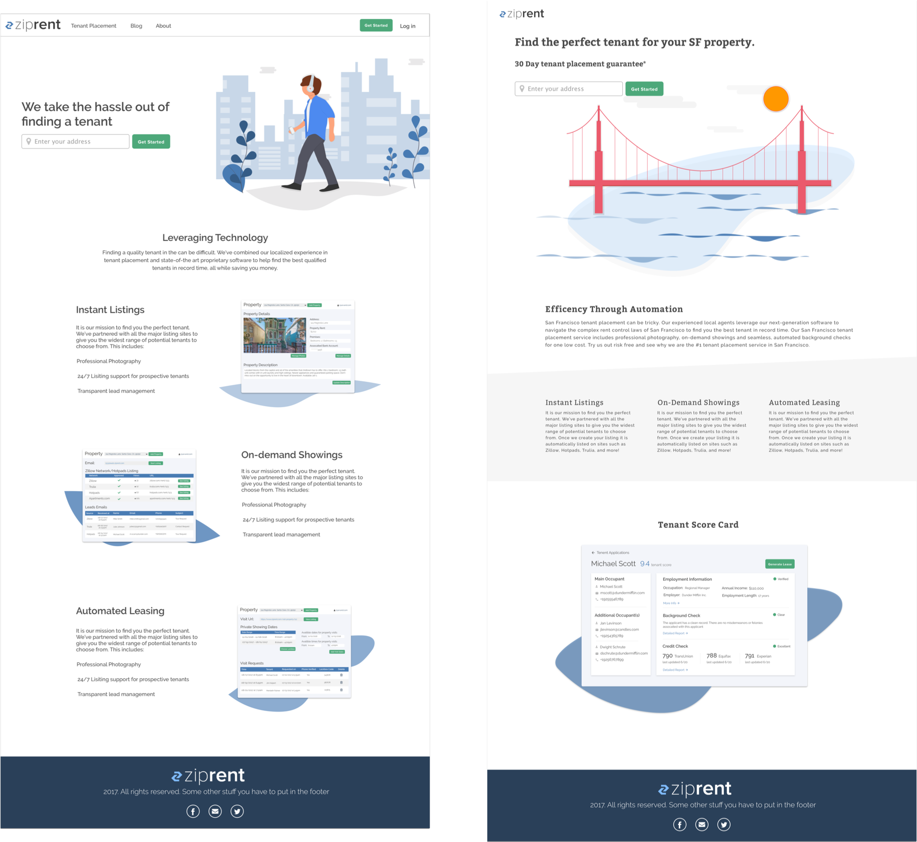
With the general style guide set, I then went onto creating a first set of high fidelity prototypes. I wanted to keep the homepage simple, drawing attention to both top and bottom CTA’s. I also employed the use of simple illustrations to create the sense of “joy” within the site, removing the clinical connotation finding a tenant may have.
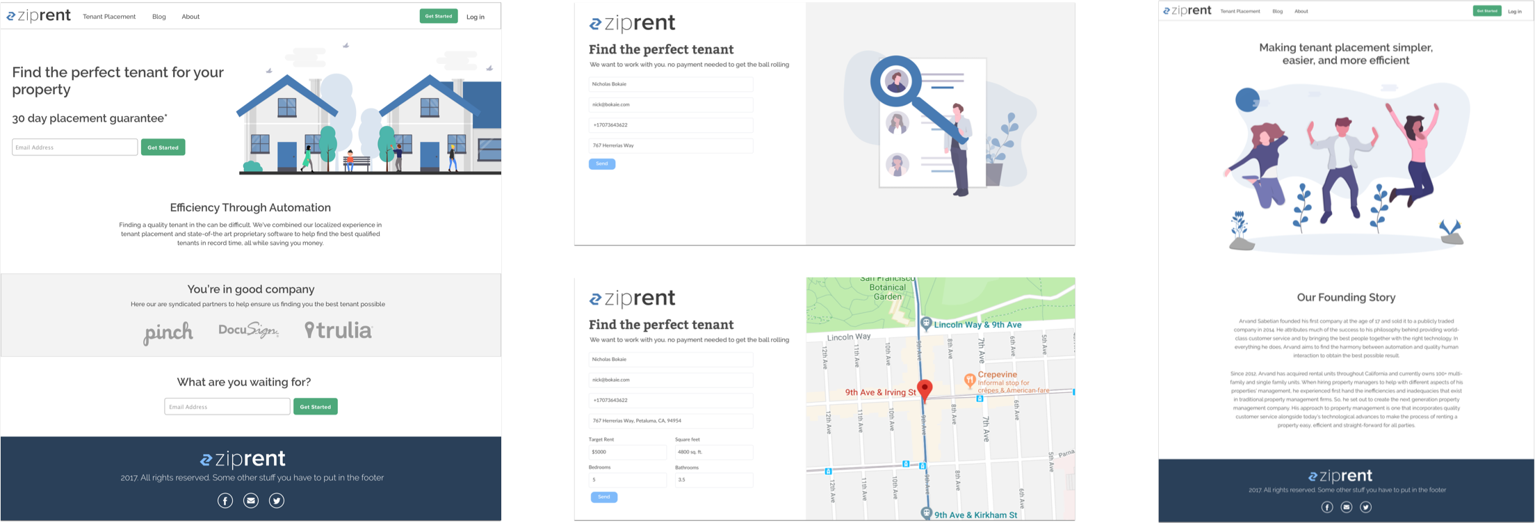
To achieve the interactive element of the sign up experience, I had the idea of making the “address” field dynamic. When the user enters in their address upon during the sign up process, we would ping Zillow’s API and have a map canvas slide in showing the location of their property with some relevant data such as target rent, bedrooms, bathrooms, and square footage.
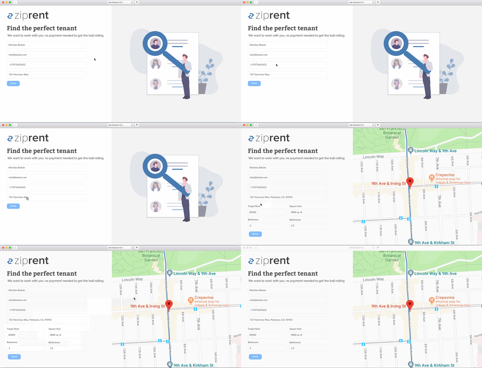
With the design set, I then began to develop the site using Middleman, a static site generator. Seeing as it site was not going to have any dynamic data requiring the use of a CMS, I felt a static site would be much more efficient to develop and deploy, while also providing quick load times. This was also a great exercise in developing with a component based mindset. I focused on writing reusable elements, allowing changes to be made quickly, and ultimately allowing for quicker development. Feel free to check out some demo examples of both the site and landing pages.