Position: Product Designer | Team: CEO, COO, CTO, Product Designer
During my time at GreenRope, my primary focus was addressing design consistency throughout the platform. When moving through the platform, there was a disconnect between feature areas which would lead to user frustrations. The main objective was to identify the various differences from feature to feature and implement a new design to eliminate any disjunction.
Due to a limited development staff, we didn’t have the resources to roll out a global styling update. We had to approach our design refresh feature by feature. This decision led to several challenges:
I felt an appropriate area to begin our design update was our dashboard. Like most dashboards, the main focus was to aggregate and provide the user the necessary data overview. Seeing as this is the first landing point for all users, I wanted this area to set the standard and tone for the rest of the UI.
Let's first take a look at the original dashboard:
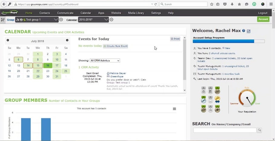
As you can see it was in need of an overhaul. A few of the issues I had with layout were:
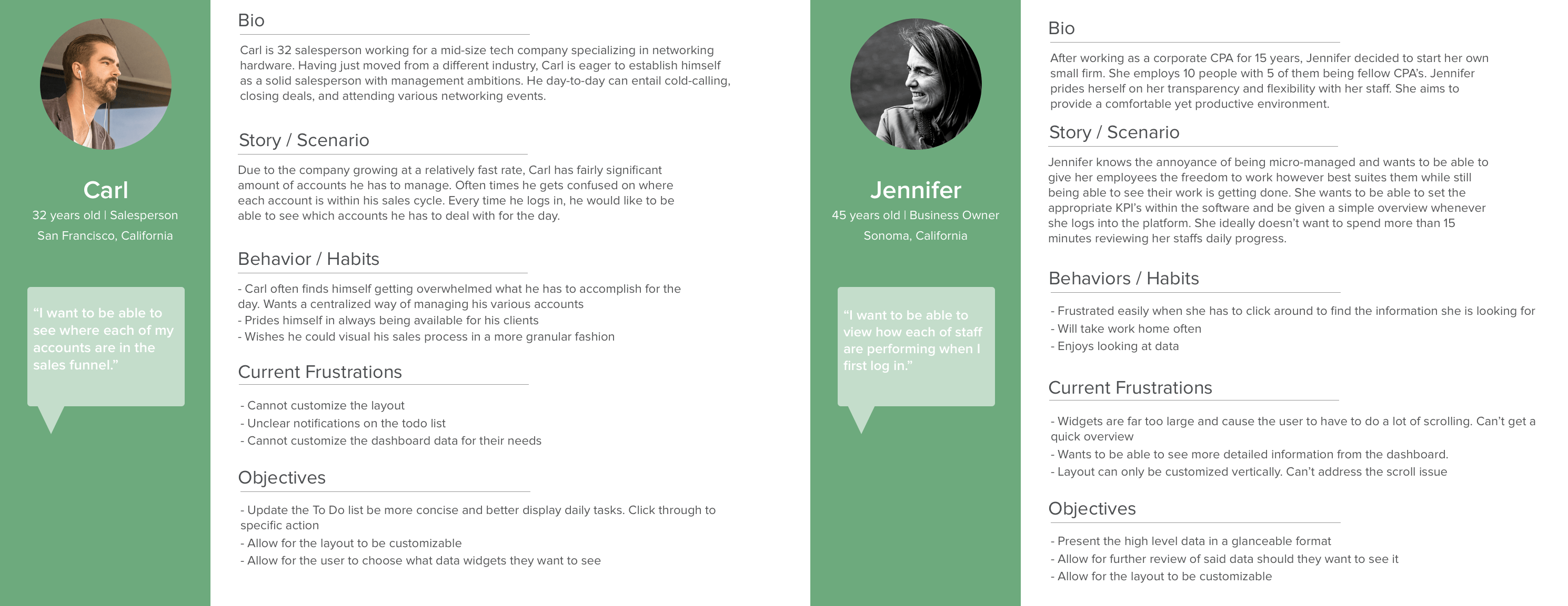
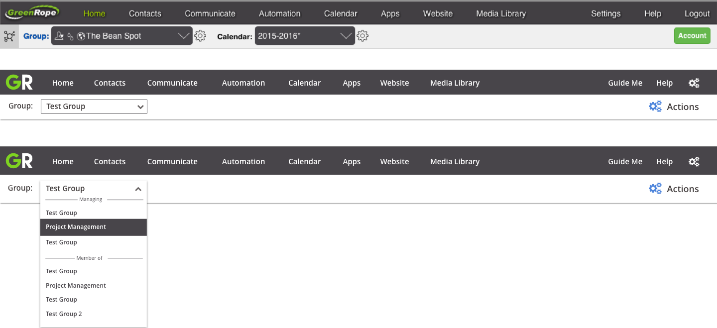
During our review of the current dashboard, I first cross referenced any feature request tickets we had to give myself a more wholesome foundation to approach the redesign. After taking those requests into consideration, I then began to create a few user personas to best understand the wants and needs of our user base. After reviewing with my CEO, we categorized the majority of our users in two sections:
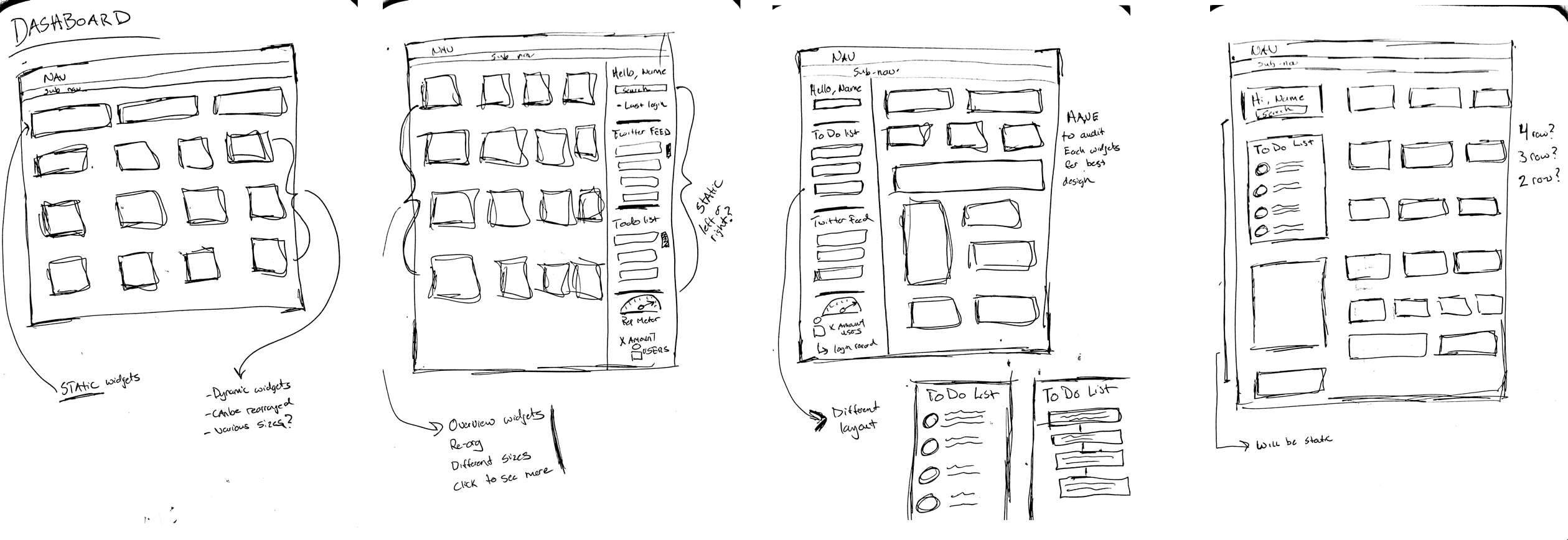
After completing the user personas, I then began sketching up some initial ideas. My focus was set on eliminating the need to scroll as much as I could. The original dashboard forced the user to scroll a significant amount to get view the various dashboard elements.
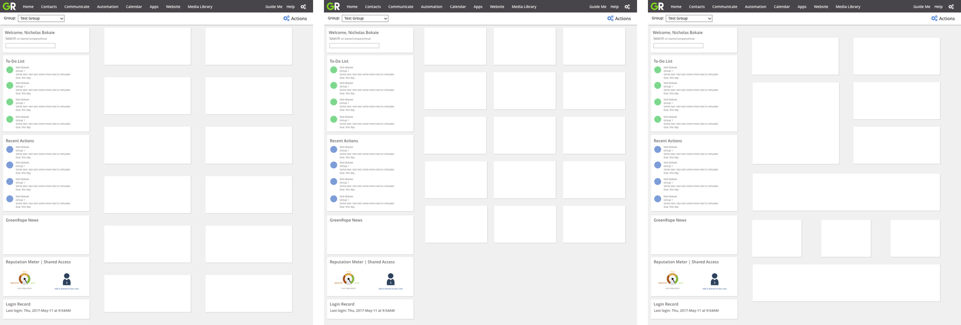
With the outline sketches in place, I then moved on to translating the redesign into Sketch. Seeing as I wanted to give the user the ability to select which layout suited their needs the best, I mocked up potential layout options. From there, I added in some demo widgets to give a cohesive representation of how the dashboard will look filled out.
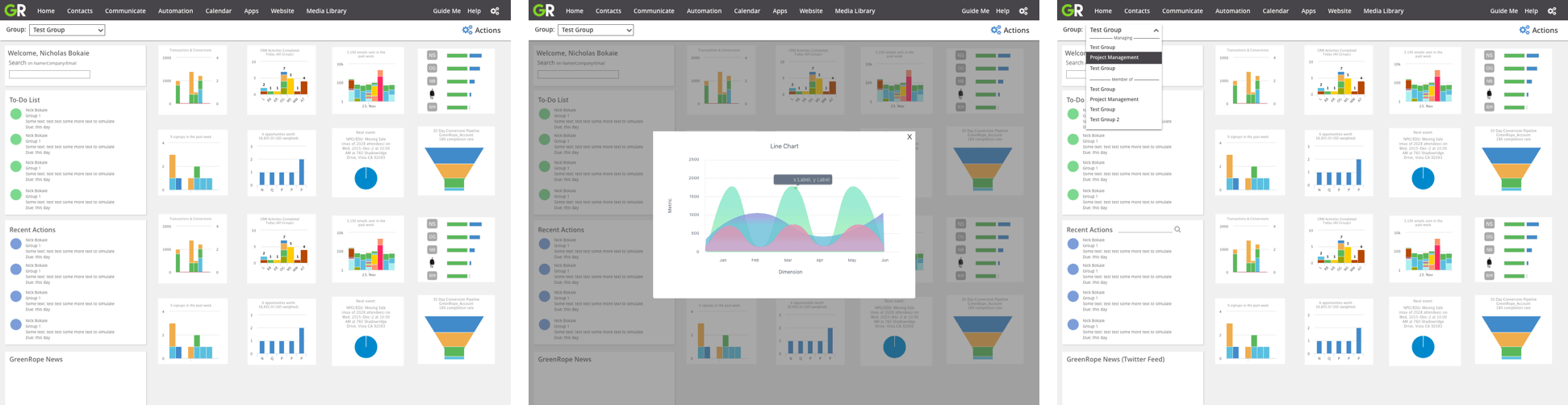
Below is a comparison of the old navigation compared with the new navigation. I wanted to reduce the amount of clutter and increase the contrast to make the navigation elements stand out more. Seeing as the application is fairly large, I didn’t want our users to get confused on where to navigate. Using feedback from our support staff, I was able to address a common frustration felt by our users.
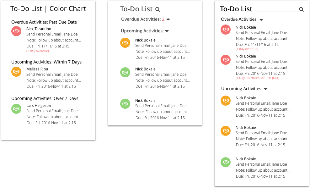
Here is a close up of our Todo list widget. The primarily function of this widget is to notify the user of current, upcoming, or overdue CRM activities. Before the update, the data was just presented in list form with the most recent activity at the top. You were not able to get a clear sense of when the activity needed to be completed. I catered the update to allow the user to clearly see when and what activities needed to be addressed.
Having the dashboard be my first project after joining GreenRope was an immense learning experience. Being the first touch point of the software, I set high expectations for myself to deliver a design which provided a fresh and modern feel.
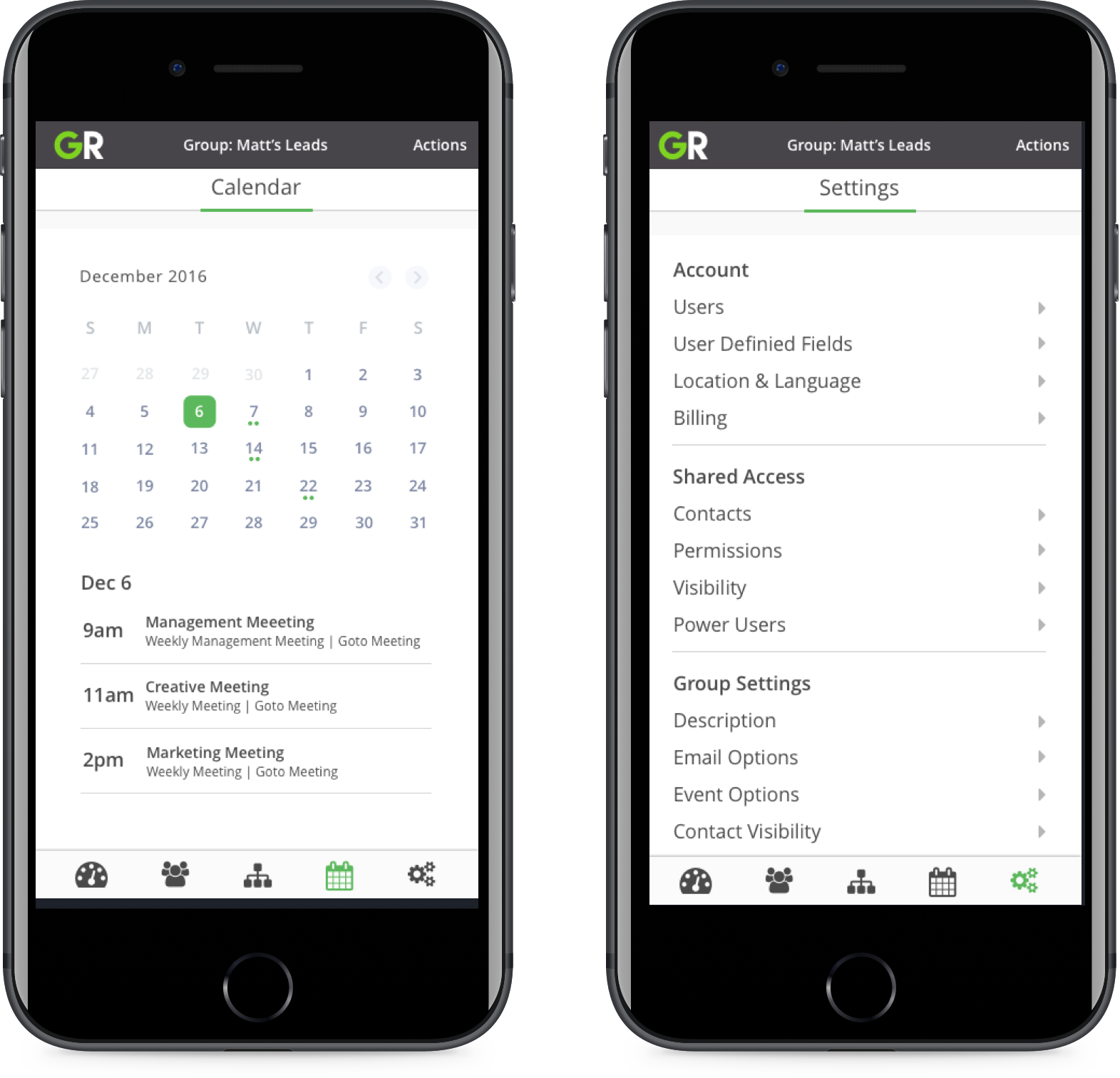
Before I came aboard, there were no set process for designing and implementing a new feature within the platform. I was able to establish a design process which took a more holistic approach to updating parts of the software:
I was able to carry out this process on subsequent projects allowing there to be a cohesive and consistent design language with every feature update.
Instead of walking through the other design updates, feel free to take a look at some of the rapid prototypes I created. I found it helped speed along the deployment of our updates if I wrote the HTML/CSS skeleton for the feature. I would then hand that over to one of our developers and we would work together to polish the design with all of the necessary data plugged into it. Keep in mind these are not the final product, but they are a good representation of the direction we ended up going.
While the desktop client was receiving a global style update, we found this a good opportunity to revamp our mobile application. Seeing as the mobile had not received any major styling update since its creation several years ago, we found this an appropriate time to create some consistency between the mobile and desktop experiences. Our goals for the update included:
While the mobile experience was limited in terms of functionality compared to the desktop experience, we decided based on the limited development time to focus on the design first before addressing bigger functionality requests.
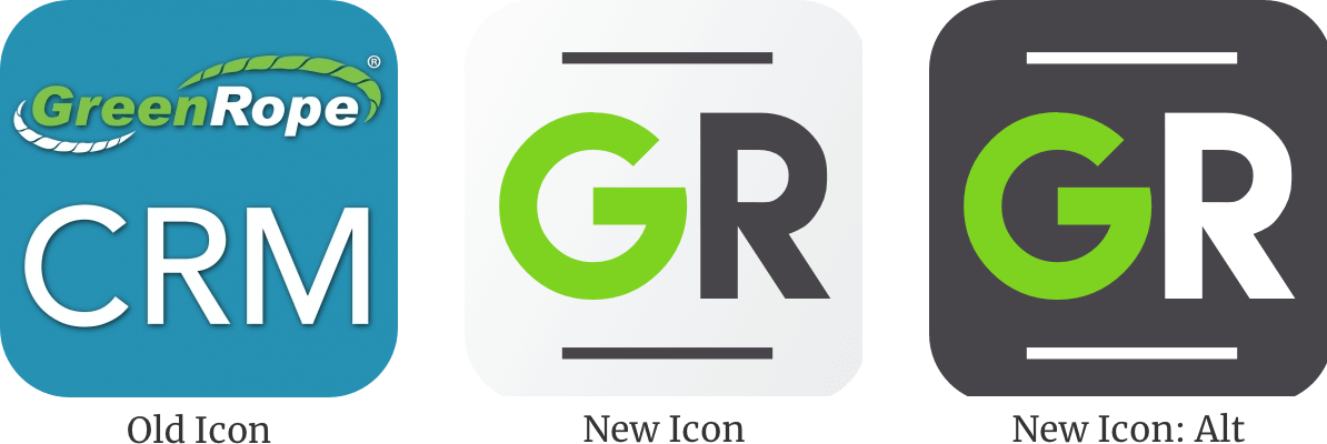
I first began by giving our app icon a refresh. The original app icon was outdated and referenced a design that was no longer used on the web application. I felt our “GreenRope” logo was too long to use within an app icon, and the we didn’t need to include “CRM” as well. Users who will use the app know it is a CRM, they don’t need the reminder every time they look at the logo. From there I used our current color palette and came up with the two options below. We ended up going with the white background option as it stood out more when placed around other app icons.
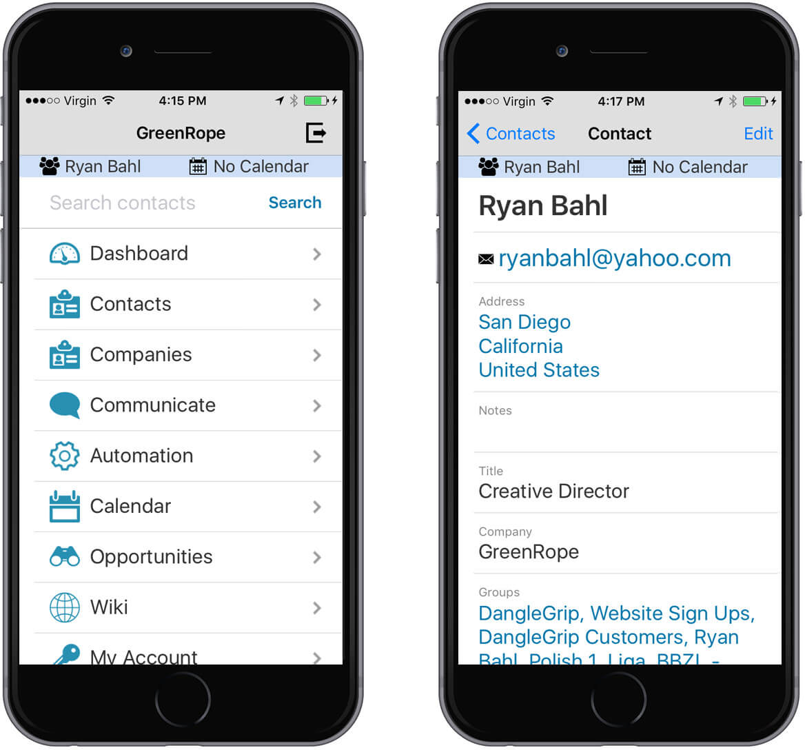
Like the old logo, the UI of the mobile app before the refresh referenced a style that was no longer used. It was a struggle to navigate around the app, as it had no global navigation. This often led to a lot of back and forth movement between pages trying to remind yourself of where you were within the app.
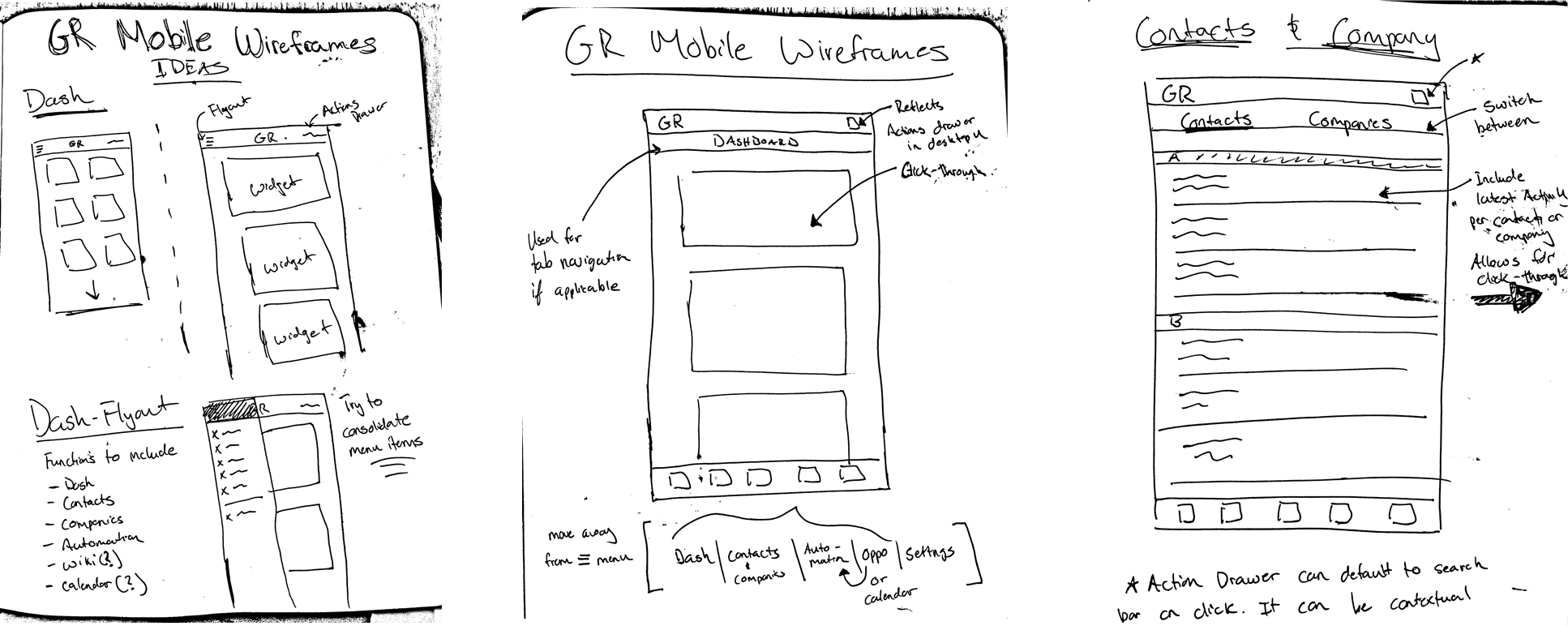
I first began by sketching some of my initial ideas with the intention of creating a more efficient and effective way of accessing the large amount of data and information.
In addition to updating the overall design of the app, I wanted to make sure the navigation architecture was up to date with modern standards and expectations. I used a combination of hierarchical and flat type navigation to give the user a straightforward and familiar approach to moving throughout the app.
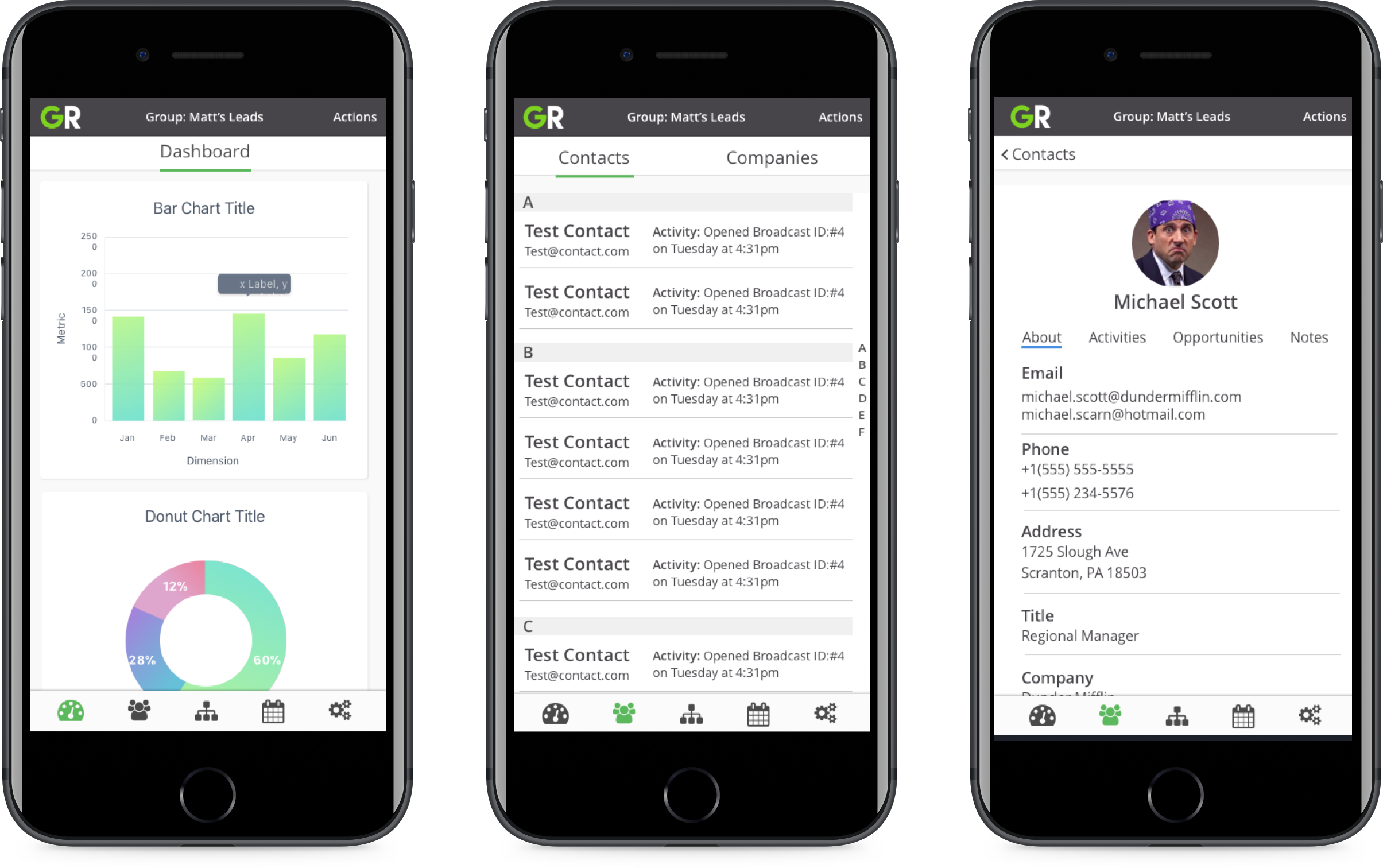
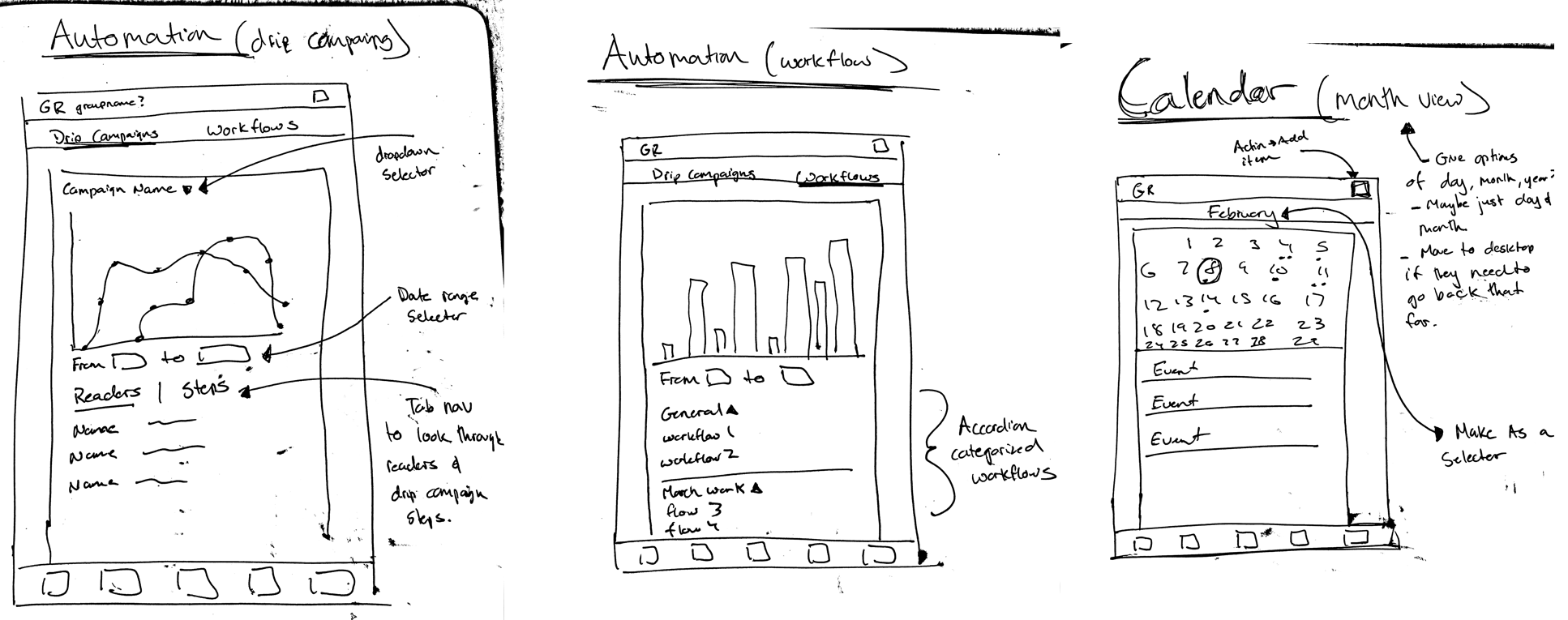
You can see within the examples how we structured the navigation. For our main navigation we broke it down categorically into 5 sections:
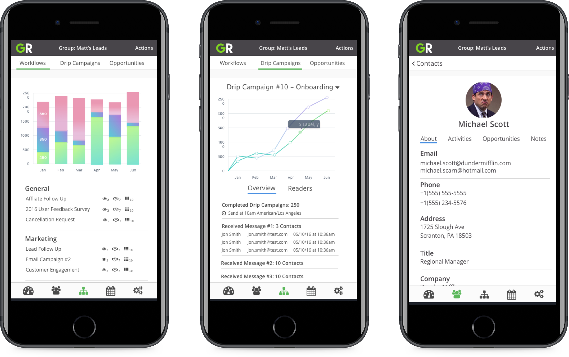
Depending on the category, I used a combination of either flat-type or hierarchical navigation for that section. For example, within the the automation tab, it made sense to break the 3 automation categories into their own tab. From there the user is able to hierarchically click into a campaign or workflow if they want to see more detailed information.
For an interactive walk through of the app, you visit the Invision prototype here!
Being the only designer on our small team, I was disappointed that we didn’t have enough time or resources to give the mobile app the true refresh and update it deserved. It was a tough challenge to have to hold back on pushing designs through that addressed common complaints from our users. Because we had limited time alloted for our only developer who maintained the mobile app, each design update had to be cognisant of his time. However, given the constraints we had, I was proud of our effort to bring the mobile app into the same design language of our web application. Seeing as consistency was the main motivating factor, I felt we laid a solid foundation to work from should more resources be available in the future.